Archive for the ‘Mobile Design’ Category
Web Design Agency vs Freelancer – Which One Suits Better For Your Business
September 14th, 2023Is It Worth To Hire A Web Design Company?
September 1st, 2023Mobile First Indexing: Is this “A Thing” now?
April 10th, 2019Mobile first indexing has been the talk of the SEO world for a long time now. So, when Google officially announced its rollout last week and started migrating the sites following the best practices of mobile-first indexing, it received a mixed response from the SEO community rather than all claps and cheers. All thanks to the worldwide confusion that’s been circling around this whole mobile indexing thing.
So, what is mobile indexing and what does it mean to you as an entrepreneur? Are you required to undone everything and start afresh from scratch? Can your mobile-friendly site handle this on its own? Is this mobile indexing a blessing or is this going to be another disaster for you? Let’s find out.
What is mobile-first indexing?
Well, it is exactly what it sounds like, Google predominantly using the mobile version of the content for indexing and ranking. In simple words, it is Google’s way of serving up more relevant results to its mobile users.
From now on, the mobile version of your website will become the starting point for Google to include in their index, along with the baseline for how it determines rankings.
Google is already identifying the websites that comply with the company’s criteria for mobile-friendly design and are using the mobile version to populate the SERPs.
For instance, if the search giant selects your website to be involved with mobile-first index rollout, Google crawlers will start crawling your mobile site first and then the desktop version rather than the other way round.
Which sites will be affected?
Most likely the m-dots. So, if your website has different URLs for both mobile and desktop version, your website will be indexed based on the mobile version.
But then, if you have the same URL on both mobile and desktop, still it can be affected as your website might supply the crawlers different information for both versions, in which case, Google will prioritize the information for mobile when indexing.
What should I do about mobile-first indexing?
The simplest answer I could suggest is to use a responsive design. Because in case you remember, Google bots have been checking the mobile performance including the loading speed, content layout, etc. even before mobile-first indexing. Responsiveness is the way to go.
And in case you are using a separate mobile site, then you should consider the following options.
- Keep the content same for both because if you provide less content on mobile, then “less” is what Google will index.
- Consider using the same structured data markup on both the versions and avoid adding any data irrelevant to the page content.
- Do ensure that the titles and meta-descriptions are equivalent on both versions of all the pages.
- Do not forget to add social metadata such as Twitter cards, OpenGraph tags, etc. on both the versions of the site.
- Also, make sure that any links to sitemaps including the robots directives are accessible from the mobile version of the site.
- If you have verified only the desktop version in Google search console, do add and verify the mobile version as well.
- Lastly, if you have recently implemented the mobile switchboard tags, then they should remain the same. Do not change these.
Do I really need to do all this?
Well, no. if you are certain that your website is fully aligned with Google’s rules and best practices, then you need not do anything. But in case you have doubts, hire a worthy SEO team that knows well how to execute this perfectly.
Best Practices for Exercising Mobile Web Design in 2018
May 21st, 2018After the launch of the iPhone, the demand for building separate websites for separate devices increased tenfold. Though there was nothing complicated (in fact, it was comparatively easier) if you see this from the development perspective, it doesn’t come with its own set of drawbacks.
For e.g. having to promote and maintain separate sites for SEO rankings was a lot of work, not to mention the maintenance costs that come with it. Also, since mobile phones and tablets come in all screen sizes, creating websites for each and every one of them was next to impossible. So, there has to be a better way to deal with the situation, right?
Thankfully, web designer Ethan Marcotte came up with a brilliant concept of ‘responsive design’ back in 2010, a concept which calls for building fluid and flexible layouts that can adapt to almost any screen size. Since then, the mobile device ownerships have exploded as compared to the traditional PCs and a major part of the credit goes to the responsive web design which ensures users have a great viewing experience regardless of the screen size.
Nowadays, creating a website is nothing more than a child’s play, however, assuming that optimization for mobile browsing happens automatically after you finish creating your website is actually childish (pssst, avoid it at all costs). So, if you have made up your mind to go mobile, at least do it correctly. For starters, understand these facts well enough,
- The site visitors will always access your site in all situations (even if in a hurry).
- Small screen size greatly alters the way users interact with your web content, no matter how mobile-friendly site you make, it won’t be convenient enough when compared to full-screen
The key here is to keep the mobile content clear and succinct but not at the cost of its quality. Moving on, I have presented 6 of the best mobile web design practices in this article for you to follow if providing an appealing and enjoyable content is your top priority as a site owner.
- Homepage and navigation
There are a few points to keep in mind while considering homepage and navigation for your ‘mobile-friendly’ site such as-
- Keeping calls to action above the fold.
- Making it easier for users to get back at the main page.
- Keep your menus short and easily accessible.
- Avoid unnecessary promotions as much as possible.
- Create ‘responsive’ content
Space is always at a premium when it comes to viewing content on smaller screen sizes. However, some common mistake rookies make at this point is trying to squish all the content to the mobile screen that was originally meant for the desktop.
But you can avoid this by keeping in mind the different screen sizes from the very start and re-evaluating the existing content (based on their usefulness) accordingly. Next step involves narrowing down the essential content to the point where it becomes easily digestible and crafting concise and to-the-point content out of it.
- Visible site search
Never ever try to hide the search box in a menu as this is one of the first things users’ lookout for when they want information. While searching too, users generally lack the patience to scan through multiple pages for their desired info, so make browsing easy for your users by including misspelling corrections, suggesting related queries, auto-completing queries etc. You can further ease their browsing journey by placing filters above search results.
- Fluid images and video
One of the biggest benefits of using fluid images and videos for your mobile-friendly website is that they are non-negotiable for responsive design, not only in terms of design but cropping as well. Some such ways are –
- Rendering images based on room availability in HTML container.
- Crop images on smaller screens to retain their impact.
- Use Scalar Vector Graphics to change resolution based on image paths rather than pixels.
- Declutter your site
If clutter is bad for your desktop then it is worse for your mobile where you don’t even have much screen space, to begin with. Every button, image, icon that you add makes the screen that much complicated and in turn, clutter your interface while overloading your users with too much information.
When designing your website for mobile, try to get rid of anything that isn’t absolutely necessary. In this way, by reducing clutter you will significantly improve comprehension.
- ‘Touch-friendly’ design
Though featuring concise content and scaling down your website for different screen sizes is important, it isn’t enough for implementing a ‘touch-friendly’ design which requires the design to be navigated with person’s (clumsy) fingers.
- Provide large and descriptive buttons for easy click and bump up the font sizes accordingly (at least 16 px).
- Completely avoid pop-up boxes and certain effects that cannot be translated easily to mobile devices.
Closing Thoughts:
Responsive web design isn’t just a matter of choice anymore since Google has recently prioritized the mobile-viewing experience of any site into its SEO algorithm but has become an essential element to include if you wish to see your site in search results.
We become Best Web Design Company 2017 in Los Angeles
April 25th, 2017Clutch recently named us as one of the top web design companies in the LA metro area. This is the second year in a row that Clap Creative has received such an award from Clutch.
Clutch is a DC-based research company that evaluates and publishes reports on the leading IT and marketing companies across dozens of US cities and countries. Analysts at Clutch do an internal assessment of these companies by looking at their previous experience, service offerings and industry awards, among other criteria. The biggest differentiator of their research process is that they interview a handful of each company’s clients and publish their comments on their site for business buyers to see.
In their official press release announcing the top LA web design companies, Clutch Senior Analyst Eleonora Israele stated:
“A company’s website is often a buyer’s introduction to a product or service. The leading companies in our research have proven their ability to create websites that truly reflect their clients’ companies and make them stand out from their competitors.”
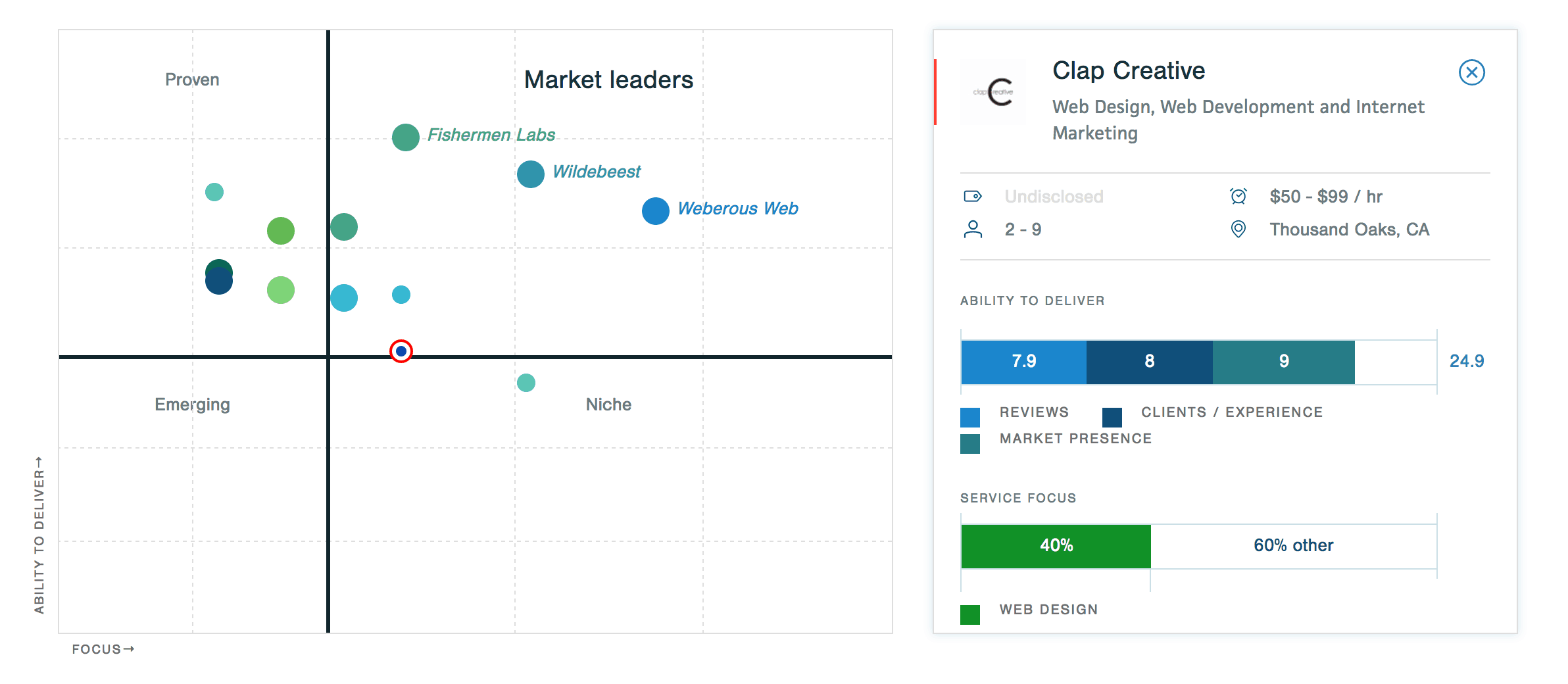
We worked with Outcome Tutoring, a college tutoring company, to build a website for their business with an online booking tool that allows students to see each tutors’ availability and schedule a session. Once the project was completed, their founder said the following:
“The website that Clap Creative developed automatically made us into a more sophisticated company. We were initially just completely bare bones, all hustle, and all grind. Now we have a complete, functioning website. Because of that level of sophistication, we also have a lot more viewership of our site and more bookings. With bare bones, people won’t trust your company as much. Now that we have a way to let people know that we have a good, functioning company, they trust they can spend their money with us. Our client return rate is much higher now.”
We’re thrilled to have made the list for the second time, and can’t wait for a third one next year!
Cricket All Stars 2015 – One of our best pieces of work!
October 14th, 2015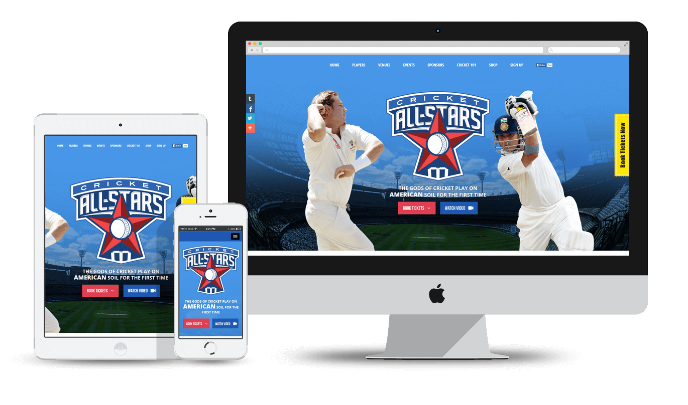
At Clap Creative, our designers and developers are always committed to delivering world-class website designs along with cutting-edge web applications. So far, we have created various amazing websites, exceeding our clients’ expectations.
Another feather in our cap is the cricket All Stars website and we have just fallen in love with this website. It’s not just because we are hardcore cricket fans, but there are amazing features integrated into the website, making it our best portfolio website of 2015.
And Its Best for a Reason
First of all, we are really proud to say that our client, Leverage Agency, were really impressed with our work. And for good reason! Cricket All Stars is a tremendous showcase of the new web dynamics, be it designing, ticketing, responsive site to name a few. It allows people to book their tickets online for the upcoming cricket series in the United States. This site is developed on Bootstrap 3, PHP and the shop (upcoming) is based on Magento and provides utmost convenience to the people who are die-hard cricket fans.

Fast, Feature Rich and Intuitive – That’s Cricket All Stars for You!
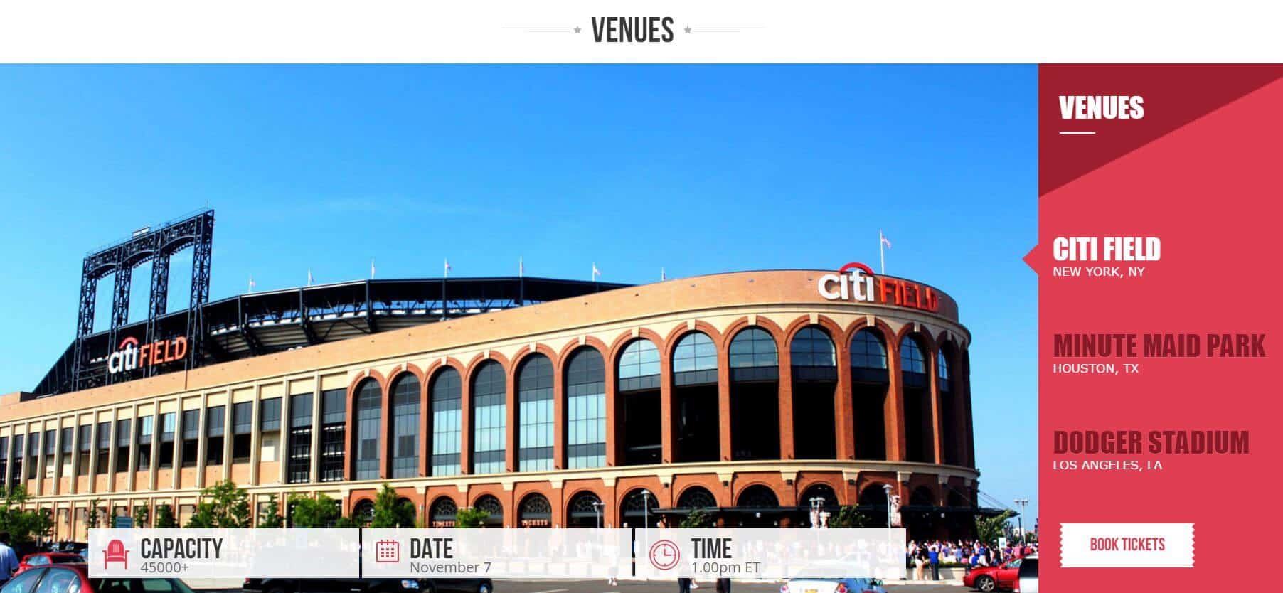
We make sure our websites have fast loading time so that the users don’t switch to other websites. All the icons, content and graphics are clear and understandable to make the perfect first impression. Navigations are clear and accessible. All the necessary details are mentioned on the homepage, including the teams playing, player information, venues, timing, and everything one is looking for.
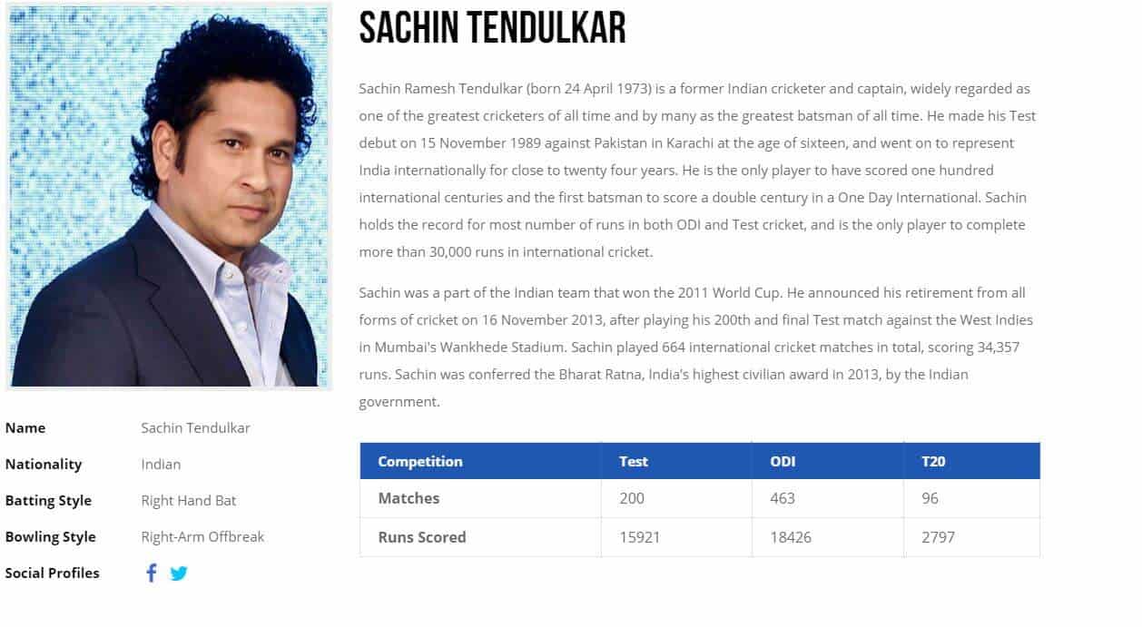
If you want to get more information about the players, you just need to click on the picture of your favorite player and there you get a sneak peek into the life of your idol. Also, there is a yellow color icon placed ‘Book Tickets Now‘ that allows the user to book the tickets with just a few clicks. The website is completely responsive so it looks good on each and every screen in the world. There is a signup form at the bottom, users can either sign up through their emails or through social networking websites such as Facebook and Twitter, etc. With these features, we just aim to provide a wonderful experience to the users.
Get Immersive Cricketing Experience
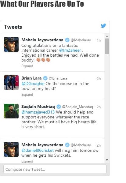
We understand that people are always eager to know about what their favorite cricketers are up to. That’s why we have added a section where users can read the latest tweets of the players. This can be called a ‘cricket encyclopedia’, since we have made every best effort to add all the necessary features and icons that can help people stay up-to-date about the latest cricket events.
For newbies, we have added a section Cricket 101, where all the relevant and necessary information about cricket techniques are mentioned. Facebook, Twitter and Email icons are placed on the right side so that people can share the videos, tweets or any other information with their friends.
In short, it is a fully functional, accessible, interactive, search-engine friendly website with flexible grids and creative styling. Just visit the website and feel the difference.
So, you see, we have a great contender for our ‘Best Website in Our Portfolio 2015’.
What are the secrets of creating award-winning design?
August 17th, 2015When it comes to conversions, the design of your website plays a far more crucial role than you think. You can utilize any strategy in the world to boost conversions, but if your website design looks like crap, all your efforts will go wasted.
Design is not just art. It is also marketing. Here are the secrets of creating an award-winning website design.
Visual Hierarchy
Visual hierarchy is the order in which the eye perceives what it sees and is very important for creating a great web design.
Some parts of your website – calls to actions, forms, etc – hold more importance than others and you want these parts to get more attention than less important ones.
Are all the 10 items in your website menu equally important? Where do you want your site visitors to click? Put the important links under spotlight.
Your business objective decides how the elements will rank on your website. Without a specific goal, it’s hard to know what to prioritize.
Hick’s Law
Hick’s law says that as the choices increase, so does the time it takes to make a decision.
The more choices you give to your website user, the more difficult it will be to choose one, or worse choose anything at all. So in order to deliver a more enjoyable user experience, we need to first remove choices.
To create an award-winning web design, the process of removing distracting options has to remain consistent throughout the entire design process.
In the era of countless choices, consumers need better filters. If you sell a wide variety of products, add better filters to allow easier decision making.
Fitt’s Law
Fitt’s law says that the time required to reach a target area (for instance, call to action) depends on the distance to the target and the size of the target.
Meaning, it is easy to reach an object which is bigger and closer to us.
But it doesn’t mean that a button should be designed so big that it takes half the screen. It will become much easier to click a tiny button when it is given a 20% size increase.
The size of a button should depend on its expected use. You can analyze your stats to find out the buttons people use the most, and make such buttons bigger (easier to click).
For instance, there’s a form on your website you want visitors to fill. At the bottom of the form, there are two buttons: “Submit” and “Reset.” Most users will hit ‘submit’. Hence, this button should be kept bigger than ‘reset’.
White Space & Neat design
White space is the portion of a web page left “blank”. It’s the space between graphics, visuals or margins.
This “empty” space is an important element of website design. It allows the elements in it to exist at all. White space defines the implementation of hierarchy. The hierarchy of color, images and information.
A web page without white space, stuffed with graphics or text, is at the risk of appearing cluttered, and is typically hard to read.
Adequate white space makes a website look ‘neat’. While simple and neat design is important for sending across a clear message, it doesn’t mean fewer content.
A neat website design makes the best use of the white space in it.
Conclusion
It is important to design a website for the user and have clear business objective in mind. Using these web design secrets you can achieve award-winning results.
10 PSD to Responsive Tips that Every Front End Developer Needs to Know
April 10th, 2015Responsive design has become the latest trend-setter in the web development industry. With the dominance of HTML5 and a new level of Cascading Style Sheets – CSS3, website developers emphasize on making a responsive website using the ‘Media Queries’. However, sending files in for PSD to HTML conversion can have a big impact on how accurately the designs will be converted without any bugs.
In the PSD to HTML conversion industry, there are numerous Photoshop designs. Some of them are very easy to work with but some have increased the standard PSD to HTML production time. Not every Photoshop designer is worth the money.
Here are some Photoshop tips that every front end developer needs to know for time and cost-effective project completion.
Leave the Layers Intact
In order to keep the file size smaller, many designers merge the layers. This technique works well in print design, but in PSD to HTML conversion, the developer needs to have all ”the effects” such as graphics, textual or adjustment layers intact. This is crucial because all these attributes carry important information for the whole website development, such as font families, font sizes, colors, line heights, text transformations, etc.
Tip: Make sure, while delivering the design files, you leave your layers intact, in order to preserve all the vital information for developers.
Organize your PSD
Well-structured and organized PSD files can be easily converted to HTML. Wondering Why? Because, nicely organized PSD files are highly beneficial for both a coder and layout designer’s perspective. Productivity increases leaps and bounds if files are structured coherently.
Tip: Always keep the PSD files neat, tidy and highly organized with relevant names. It will surely keep productivity high and expenses low.
Keep Design Consistent
Always try to keep design elements consistent across the layouts of your website, including your buttons, both header and footer, rounded boxes etc. Any exceptions will undoubtedly lead to extra time to convert the HTML or CSS code, and will eventually increase the development time.
Tip: Keep your designs consistent to make them look professional and reduce the development time.
Place Elements on Grid
Design grid is a vertical set of guidelines that makes your further job much easier. Utilizing the grid allows the designers to place the much desired website elements in proportional and balanced space and get the proper feel of design. Off grid element placement establishes extra steps in PSD to HTML conversion.
Tip: If you use grid for design, make sure you keep the elements inside the grid and aligned (even if you aren’t working in the explicit grid).
Prepare Rollovers
When preparing your design, you must focus on the functionality of links and all call to action elements. It has become a part of the standard practice to add rollover states to the elements such as buttons and images, in order to distinguish them among the action states.
Tip: Make sure you don’t forget to design the rollovers and define time, if you don’t want to spend more time creating them later when you start working with live templates – this will increase your production time.
Provide Consistent Hands-off Materials
The hands-off documents like: PSD, fonts, JPG previews and even PDF specification write-ups, which are delivered to PSD to HTML conversion team, should contain final versions of the designer work.
Tip: Make sure you keep all hands-off assets consistent, including font sizes, font families and design elements.
Consider Fonts Rendering Differences
When using modern fonts, consider the differences from browser to browser. Font anti-aliasing and tracking may be displayed differently in Photoshop and in the browsers.
Tip: If you are concerned about how your font may seem on live website, check it out in various browsers before you opt for one specific.
Avoid using Blending Modes
Remember, blend modes used in Photoshop are nearly impossible to recreate in CSS. They are meant to produce amazing effects and shorten the time of image processing. However, eventually they don’t get the desired results. Thus, they are good to use for preview, not for PSD to HTML conversion.
Tip: Your PSD files should be and use just normal blending mode.
Consider Content Flexibility
Some designs allow only a fixed amount of text space which doesn’t allow adding more text. Sometimes it might work, but in most cases you need to add more text on the live website. So, always think about content flexibility.
Tip: Always keep content flexibility factor in mind and assume the possibility of increasing or decreasing the amount of text.
Design Layout for Common Resolution
Common browser resolution is a very specific subject, however, with responsive approach the screen resolution becomes less important. But, if your design isn’t responsive than the most common screen resolution is 1366 x 768px.
Tip: If your design is not responsive, make sure you pay additional attention to the screen resolution and do not make it wider than 1300px.
You must follow all the above mentioned PSD to HTML conversion tips to build as a great HTML developer.